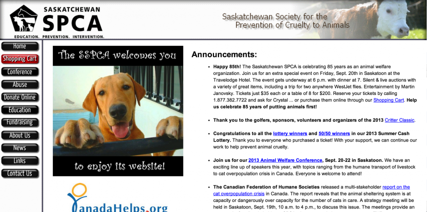
In our ongoing effort to show you some neat-oh before & after shots of some of the websites we’ve worked on, next up on our list is The Saskatchewan SPCA. We’re wimps when it comes to animals, and jumped at the opportunity to redesign their website. While the old version of their website worked in the early years of the internet, people grew to expect more images, more information, and most importantly, an easier form of navigation.

Old Sask SPCA Website Design
The old version was built using the ancient method of html iframes. Making it hard to update just about anything,but allowing the navigation to remain in one file, while it loads the rest in alternative frames. This type of setup required constant update requests to their former web developer, and the ongoing bills to go along with it. I cant rip their old site too hard. If it weren’t for this method of building websites, young 12 year old Corbin wouldn’t have been able to manage his hockey teams Geocities website (Go Flyers!). Fortunately I picked up a few skills in the last 14 years, and we had big plans for changes.
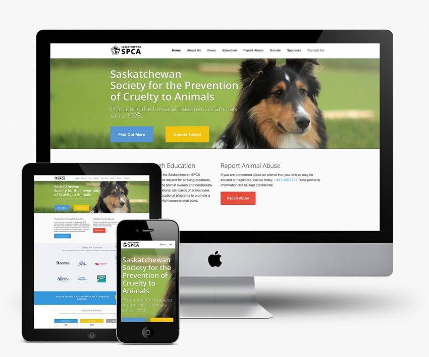
A Modern Clean Website Design
We knew the update had to be fresh, new, and bring this non profit into the modern era. A site that they could update themselves, and really have the site work for them, rather than just becoming another brochure-ware website. We pitched the SSPCA a modern, clean, minimalistic website design that provided 4 clear actions.
- Encourage the user feel emotion via strong imagery that randomizes on refresh. (That sad looking dog, that’s Finn, my family dog. He’s not normally sad. What-up Finnigan?!)
- Establish credibility via Call to Actions / Hero Text
- Entice users to make an online donation
- Allow the user to find the information they’re after within 2-3 clicks.
We wanted the navigation to really up its game, and be easily found on all pages. Primary navigation would sit up top in the white navigation bar along with their logo, while secondary navigation would find its way to the left sidebar on pages that required it.
We pitched the no dropdowns treatment on this website, as most donators & members were +40, and if you’ve ever watched your parents or grandparents browse the internet, you’ll know that this particular age bracket doesn’t always play nice with hover state dropdowns.

New Sask SPCA Website Design
The New Sask SPCA Website Design
On top of this all, we wanted the website to be easily accesible across all platforms. We wanted a user browsing on a beat up Android to have as close of an experience as possible to the user browsing on their brand new iPad, or Laptop.
We built the Sask SPCA website on our favourite responsive framework, Zurb Foundation. Knowing their user base were primarily rural Saskatchewan folk, we assumed their devices may not be the most modern, and may be running some old versions of Internet Explorer. We used Foundation 3, as it played nice with IE 8, and even IE7 with some css hacks in place. According to their analytics, we were right, as they still receive a fair amount of users using ie8. Fortunately the majority are using ie9 now, but in hindsight I’m happy we played it safe.
While the folks at the SSPCA worked on revising some of their content from their headquarters in Saskatoon, Saskatchewan, we were hard at work on their website design in Regina, Saskatchewan. This project was a testament to working remotely.

We’re extremely pleased with how the whole website turned out. The Sask SPCA now has the ability to share more education articles, accept different types of donations, and easily update their own content without the constant need to reach out to a web developer. Their recent Animal Welfare Conference was a knockout event that brought in people from all across North America to learn about the latest trends in the Animal Welfare and Animal Shelter industries. We’re extremely pleased to have been a part of it, and are loving the ongoing work we provide to the SSPCA.
