In late 2011 the Saskatchewan Sports Hall of Fame put out a Request for Proposals to re-brand their current identity with a new logo and a new website. With the help of Corbin’s contacts and clients out in Saskatchewan we had built up a decent size client base while still operating primarily from Halifax. Because of that we were lucky enough to be on the list of recipients of the Hall of Fame’s RFP. To be honest, when we first received the RFP, both Corbin and I were a little surprised that we would even be considered for such a large project. Up until then, most of our website projects were medium sized at best. We had our work cut out for us!
To our delight, we won the bid and planned on starting work right away. At that point, the SSHF provided us with their newly revised Strategic Plan for 2012 and the years to follow. They expressed the need to reach out to a younger market, and gain a stronger online presence through their new website and the use of social media platforms such as Twitter and Facebook. At the same time, they wanted to evoke a classic, sports feeling that goes along with any sports hall of fame. After an initial discovery session with some of the SSHF staff, we chose to split the project up into two phases – the logo phase and the website phase.
Phase 1: New Logo Design
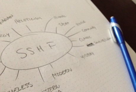
Get your sketch on!
Going into this redesign, Corbin and I had a fairly good idea as to what we wanted to achieve with the new logo concept. Like any design process, we started off sketching out every idea that popped into our heads. After hundreds of sketched logo concepts, both good and terrible, Corbin and I sat down and hand-picked roughly ten sketches that we actually thought were heading in the right direction. Throughout the revision process we managed to get the logo sketches down about five. Which meant it was time to digitize what we’d come up with.

Our (very rough) first round of mocks for SSHF
After digitally illustrating the logos in black & white, it was time to add some colour. We really started focusing on creating an emotion and theme with each shape and colour. As time flew by we managed to complete a handful of logos allowed the Sports Hall of Fame to see where we were heading. The final five were soon whittled down to one.
The logo was designed to be easily identifiable, powerful, athletic, and best of of, cost effective when it comes to print. The flame within the shield represents athleticism, and reflects the burning passion that the inductees have for sports. The primary color of the logo is orange, which radiates warmth, energy and, like the SSHF, is strongly associated with positivity and a new dawn.

Phase 2: Website Redesign
Once the final logo was chosen it was time to start working on the redesign of their new website. After doing a lot of research on other sports hall of fame’s around Canada and the world, we noticed that a lot of them (including the old SSHF website) didn’t feature their inductees very well, if at all. These hall of fame websites were also very cluttered and laid out in a non user-friendly fashion. Most of the sites we visited gave off a claustrophobic feeling, and were difficult to navigate around. This made one thing clear in our minds… Well, I guess a few things. First, we knew we wanted the user experience to be extremely simple. We didn’t want the user to feel lost, or stuck on a page and not knowing how he or she ended up there. Second, we wanted the browsing experience to be intuitive, simplistic and thought-free. We also knew that we wanted to feature the inductees on the new website and have them completely indexed for intuitive searches. In the end, 80% of people who visit the hall of fame website will be looking for relatives and friends who have been inducted, or simply just browsing around and reading up on the abundance of awesome inductees within the hall. The latter 20% would likely be looking for location and contact details.
A Look Back At Their Original Website
You have to know where you’ve been in order to know where you’re going. Their old website needed quite a bit of work. While it worked in their younger years, as technology progressed, the SSHF needed something more fleshed out.

The old SSHF website
After a few layout arrangements and several chats over some cold pints, we had a good idea of how the new website was going to be laid out in order to offer the best browsing experience for users. We spent a lot of time brainstorming how we were going to organize inductees and what hierarchical taxonomies we were going to use in order to make the inductee browsing experience as simple, but informative as possible. We sketched out a few different variations and chose our favourite and then started to whip up some design mocks in Photoshop. After the mocks got approved by the client, we spent a large amount of our time coding up the new design. In the end, the new site features a lot of really great features that other hall of fame’s don’t offer:
- advanced and basic searching capabilities – making it easy for users to find inductees;
- featured inductees on the homepage via an awesome jQuery slider;
- an easy to use inductee directory, menu list and archive;
- google maps showing all inductees hometowns;
- YouTube embedding on individual inductee pages to feature some awesome inductee videos; and but not limited to
- a mobile friendly design.
- custom taxonomies for sports, city of birth, gender, and year inducted.
This new website was launched in early 2012. It was a huge step to have their inductees in an organized database with custom post types and custom taxonomies. It wasn’t long before we had that site filled with every historical record of their inductees. After training the SSHF staff, we handed them the reins and watched them fly!
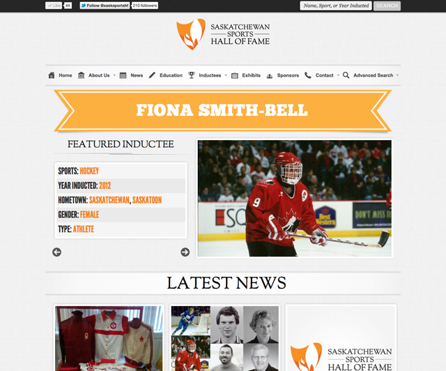
v2.0 of the SSH Website Design
Phase 3: Responsive Website
While the initial website redesign was a huge leap forward, it still had some flaws. For one, it was designed just before responsive sites were really taking off. In 2013, we saw a huge increase of Responsive Websites being designed. We got involved early with responsive design, and vowed to redo this project purely as a donation in order to a) showcase how awesome we are and b) really sell the hall of fame to its visitors.
By mid 2013 we started redeveloping the site on a responsive layout, allowing the website to conform and look good across all devices. While we were at it, we included some new features, including a video gallery, and an artifact gallery, allowing visitors to browse through jerseys, medals, trophies, shoes, baseball gloves, hockey mitts, helmets, and more!
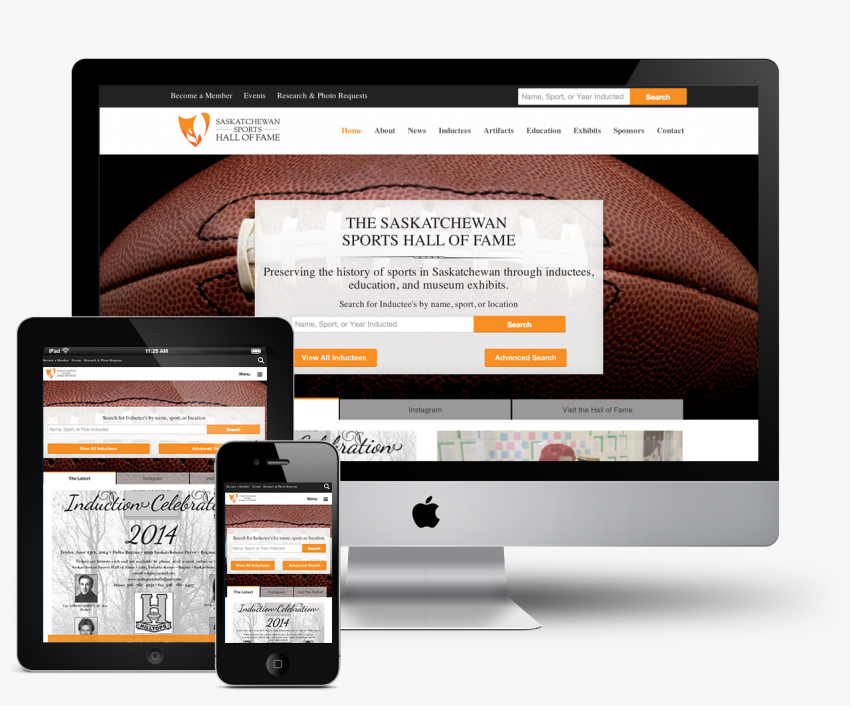
New v3.0 Responsive Website Design
With the help of our good friend Richard Finnie from Packetwire, we were also able to get the Hall of Fame set up with a couple of iPad kiosks which display the new responsive website for visitors to the museum. This allows people from all walks of life to browse inductees, artifacts, watch videos, and more.
A Successful Website Evolution
It wasn’t easy, and it’s been a long 4 years working and improving on the Saskatchewan Sports Hall of Fame brand and website, but we are really pleased with how it’s all turned out. The staff at the Saskatchewan Sports Hall of Fame are thrilled too, making us as designers / developers extremely happy and proud to have been a part of their organization and help out where we could. The SSHF announced their latest website at the 2014 Inductee Announcements, and since Phase 3, they’ve had a massive boost in website visits, have gained hundreds of more followers on their Facebook and Twitter pages, and have been featured in the local press.
We’d love to know what you think about the new identity and website. Feel free to leave a comment or two and let us know what you think!
